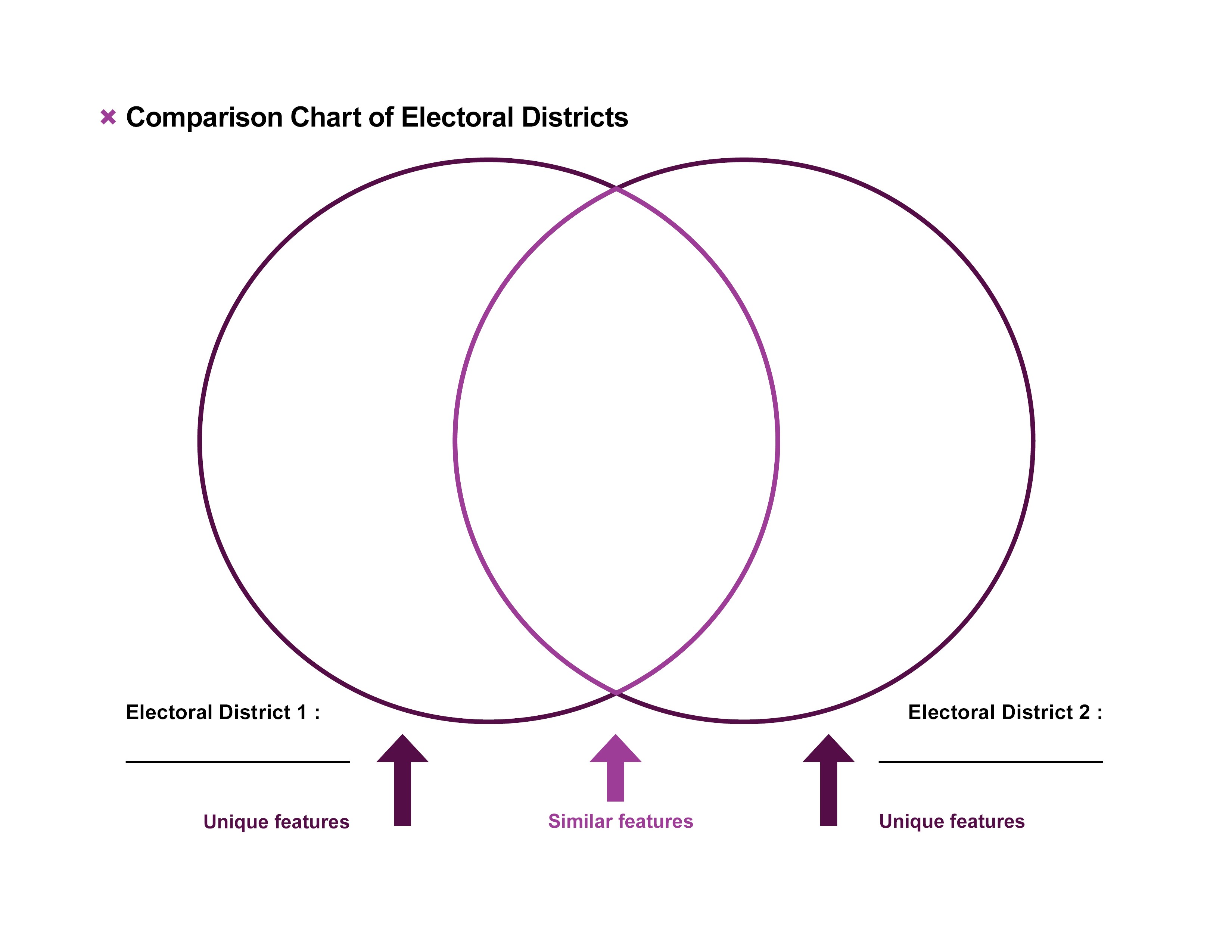
The following chart can be used as a guide to compare two electoral districts. Students can use this to identify facts that are distinct about each electoral district, and areas of similarity. The chart, also known as a Venn diagram, shows two overlapping circles. The circle on the left represents “Electoral District 1.” The circle on the right represents “Electoral District 2”.
- On the left-hand side: Put 3 to 5 features unique to your district here
- On the right-hand side: Put 3 to 5 features unique to this district here
- In the centre: Put 2 or 3 similarities for both districts here